• ARTISTS
    • CURRENT EXHIBITION
    • PAST EXHIBITIONS
    • FUTURE EXHIBITIONS
  • PUBLICATIONS
  • BRAIN MULTIPLES
  • NEWS
  • ABOUT
  • SHOP
Menu

1301PE

  • ARTISTS
  • EXHIBITIONS
    • CURRENT EXHIBITION
    • PAST EXHIBITIONS
    • FUTURE EXHIBITIONS
  • PUBLICATIONS
  • BRAIN MULTIPLES
  • NEWS
  • ABOUT
  • SHOP
×

pp bloomberg brilliant ideas.jpg

Bloomberg: Philippe Parreno on "Brilliant Ideas"

Ricardo Alessio March 30, 2017

Bloomberg's 'Brilliant Ideas' documentary


Each 'Brilliant Ideas' episode profiles an artist from around the world who specializes in a medium that could include sculpture, painting or performance art. The artists discuss their lives and careers, including how they got into the industry and what inspires their work.


Watch video here

Tags philippe-parreno
Visitors in Turbine Hall.

Visitors in Turbine Hall.

SUPERFLEX: Hyundai Commission for the Turbine Hall, Tate Modern, Britain

Ricardo Alessio March 26, 2017

SUPERFLEX

Turbine Hall, Tate Modern

3 October 2017 - 2 April 2018


1301PE is pleased to announce that Danish collective SUPERFLEX will undertake this year's Hyundai Commission for the Turbine Hall, opening on 3 October 2017. It will be the next in this major series of annual site-specific commissions by renowned international artists.


More information

The New York Times, Superflex Is Chosen for Tate Modern Turbine Hall

The Guardian, Danish artists Superflex next for Tate Modern Turbine Hall 

Tags superflex
© Ann Veronica Janssens. Photo : Isabelle Arthuis

© Ann Veronica Janssens. Photo : Isabelle Arthuis

Ann Veronica Janssens: ”MARS” at the Institut d'art contemporain, Villeurbanne/Rhône-Alpes, France

Ricardo Alessio March 26, 2017

Ann Veronica Janssens

MARS

Institut d'art contemporain - Villeurbanne/Rhône-Alpes

From 24 March to 7 May 2017


1301PE is pleased to announce MARS, a large-scale solo exhibition of Ann Veronica Janssens' work at the Institut d'art contemporain. The entire space will be dedicated to new pieces referring to existing works.

Ann Veronica Janssens bases her work on the act of perception, developing an experimental research through the prism of physical phenomena such as light, colour, sound, or mist. Using stripped-down gestures, the artist activates 'undefined zones' between blindness and revelation. These gestures seek to render manifest the indefinable and transitory nature of the very material of reality. Duration, space, and movement determine their primordial conditions.


More information

Tags ann-veronica-janssens
Top Five Buddy Cop Films, Installation view, Steve Turner, March 2017

Top Five Buddy Cop Films, Installation view, Steve Turner, March 2017

Kerry Tribe: “Top Five Buddy Cop Films” at Steve Turner, Los Angeles

Ricardo Alessio March 26, 2017

Top Five Buddy Cop Films

Amanda Ross-Ho & Diedrick Brackens, Larry Johnson & Adam Stamp, Joel Kyack & Lisa Anne Auerbach, Kerry Tribe & Edgar Bryan, Lila de Magalhaes & Roni Shneior, curated by Santi Vernetti

Steve Turner

6830 Santa Monica Blvd.

Los Angeles CA 90038

March 23 – April 29, 2017


Top Five Buddy Cop Films is an exhibition of collaborations between five pairs of Los Angeles-based artists, curated by Santi Vernetti.

On paper, the practices of Kerry Tribe and Edgar Bryan couldn't be more dissimilar. Tribe works mostly in film, video, and installation, while Bryan works mostly in painting, book design, and clay. What they share is a collection of overlapping interests and approaches to making. Both explore the boundaries and possibilities of gesture and representation within their chosen mediums. They also share a rich history of collaboration with other artists, friends, and strangers.

More information

Download Press Release

Tags kerry-tribe
Uta Barth, In the Light and Shadow of Morandi (17.01), 2017, face mounted, raised, shaped, Archival Pigment print in artist frame, 48.75 x 52.75 x 1.75 inches (framed), edition of 6, 2 APs.

Uta Barth, In the Light and Shadow of Morandi (17.01), 2017, face mounted, raised, shaped, 
Archival Pigment print in artist frame, 48.75 x 52.75 x 1.75 inches (framed), edition of 6, 2 APs.

Artillery: Uta Barth at 1301PE

Ricardo Alessio March 26, 2017

Uta Barth by Ezra Jean Black

Uta Barth's work has always dealt with the way images and perceptions are shaped through both the tools and conventions of image making. Much of that work has addressed more specifically divergences between those synthetically shaped and focused perceptions and expectations conditioned by convention. In the body of work currently on view at 1301PE, shape itself is made the 'foreground' threshold for what becomes a dazzling play on the essential materials of photography and image-making generally. The subject is nominally a bar or serving console with bottles, decanters, vases and other vessels arrayed across it – the kind of still life that was a favorite subject of Italian painter, Giorgio Morandi; and In the Light and Shadow of Morandi becomes clearly, not only an homage to Morandi, but itself a kind of painting with refracted light. The process is willful and deliberative in every respect, yet also admitting of mystery. 'Field' here is shaped subtly into simple polygons and floated within the framed squarish rectangle – echoing the severe rectilinear geometry of the bar. The bar is mostly blacked out; but even here, Barth subtly conflates and confuses its structure with its shaped polygonal support. The angle seems to shift, elongate, flatten. Slits or storage spaces (or apertures?) reveal openings or other vessels beneath the bar's surface. The focus and emphasis are on the silhouetted verticals of the vessels infused by the (mostly horizontal) refracting light and its luminescent color – dazzling and ethereal. The vessels are rendered as distinct worlds, alternately separated crisply by white space or clustered close; yet not bleeding so much as displacing each other, each preserving its specific transmuted atmospheres in a spectrum of glass-inflected colors: chartreuse veering into olive (or even 'bottle') green; azure and sapphire; amber, rust and ox-blood red; and a host of smoky grays. Occasionally a refracted wave makes a jagged trajectory across the field; zones of color are layered within a vessel; or a human arm (similarly transformed and luminescent) intrudes upon the tableau to grasp a glass or vessel, setting off its own disturbances – e.g., an inverted parabola of light. 'Ghost' lights linger here and there upon the opaque blacks of the bar. In another Untitled series (only one of which is on view here), Barth fixes her thoughtful gaze on an exterior wall – as powerfully and poetically as she does on the classic Morandi motif. This is work that stands in no one's shadow. 

View article here

Read More
Tags uta-barth
Uta Barth, 2017. Installation view 1301PE. 

Uta Barth, 2017. Installation view 1301PE. 

KCRW: Uta Barth at 1301PE

Ricardo Alessio March 26, 2017

Uta Barth at 1301PE

Hunter Drohojowska-Philp praises the photographer's skill with light and shadow.


Uta Barth is best known for her photographs chronicling the effects of light in her studio, images that are minimal in both their appearance and sources. Her exhibition In the Light and Shadow of Morandi at 1301 PE is a more dramatic intervention. By placing colored glass vessels on a table in her studio, she photographed the effect of light passing through them to cast colored, rippling, fanciful shadows.

The show is an ode to the modern Italian artist Giorgio Morandi, who repeatedly painted still lifes of bottles, bowls and pitchers in a monochromatic and poetically simplified manner. Barth follows his method of returning repeatedly to similar compositions in order to concentrate on the relationships between the shapes of different vessels, the effects of light, whether radiant or cloudy, the range of possible colors.

Barth is not slavishly copying but borrowing from Morandi to analyze the differences between the individual perception of a painter and the camera's eye. Barth compensates for the parallax distortion of photography by combining different points of view in a single image. Objects appear both solid and translucent. Are we seeing the actual vessels or just their reflections and shadows? Heightening the effect, each photograph is presented on a matte that is cut to correspond to the black table bearing the vessels, which adds to the illusion of receding perspective. One edge of the matte is colored by Barth — yellow, blue — in a way that is scarcely noticeable but still adds a sense of containment. A shadow of the artist's hand in the arrangement is included in some pictures, as it has in some of her past work, as though the artist wants her intellectually and perceptually evolved art to retain a sense of self.


Listen here

Tags uta-barth
View of "Blake Rayne," 2016–17. Foreground: A Line, 2013. Background, from left: Untitled, 2010; Untitled, 2010. Photo: Peter Molick.

View of "Blake Rayne," 2016–17. Foreground: A Line, 2013. Background, from left: Untitled, 
2010; Untitled, 2010. Photo: Peter Molick.

Artforum: Blake Rayne, Blaffer Art Museum, University of Houston

Ricardo Alessio March 3, 2017

Blake Rayne

BLAFFER ART MUSEUM, UNIVERSITY OF HOUSTON


I have seen the work of Blake Rayne in bits and pieces over the years, and in each instance I have been puzzled by what I like to call the ugly ducklings nestled within his installations. By this I mean the one work out of a gaggle of beauties that seems to be deliberately, aggressively out of place. For example, the yogurt container–cum–projection screen perched on the windowsill of Campoli Presti's London gallery back in 2012 (Yogurt Cinema, 2014). In a mostly pristine exhibition, it stood out like a sore thumb.

Sometimes the clash makes sense. The decision to hang paintings next to their wooden transport crates worked marvelously in the 2008 exhibition "Dust of Suns" at Miguel Abreu Gallery in New York, reminding us, once again, that canvases are objects, too. I therefore waited with bated breath for Rayne's midcareer retrospective, curated by Javier Sánchez Martínez, in which the ugly ducklings, with the additional context that only such overviews can provide, would finally become glorious swans.

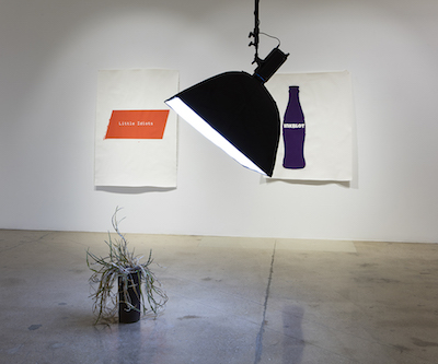
Or so I thought. Instead of finding peaceful resolution, Rayne's oeuvre seems at war with itself. Take, for example, the atrium-like entry gallery, the first of the show's two rooms, in which Rayne's well-regarded series of canvases that have been folded, sprayed, and sewn (in that order) are understandably highlighted. However, as if to slight their elegance, a gang of incompatible objects—a book of felt (A Line [Almanac], 2013), glasses on a wood table next to a plant in a cardboard box (Table of Contents, 2010), a plastic bottle (Untitled, 2016)—loiters at the center of the room. I suppose the two sets (paintings and things) share a readymade quality. But even so, their visual incongruity overshadows any sense of filiation.

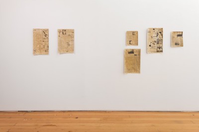
The placement of works in the second room only accentuates the discord. A small squiggly red, white, and blue canvas, Untitled, 2012, neighbors five of Rayne's iconic wall works from the series "Cover Letter," 2010, featuring felt letter a's drooping off their canvases onto the floor. Since I don't think an homage to Brice Marden's "Cold Mountain" paintings or Robert Morris's antiforms is intended, I can only assume that the disjunction between pictorial and sculptural, smooth and textured, line and letter, is the goal here.

Everywhere you turn, unlike is pitted against unlike, most jarringly whenever one's gaze crosses a towering, eclectically composed mobile of T-shirts, 3-D letters, and a bicycle hanging in the middle of the room. One corner of the room does, however, approach legibility: A pair of Day-Glo, dye-sublimation-printed abstract canvases draped with equally garish vinyl garlands, both Untitled, 2010, are a canny criticism of the arbitrary, decorative impulse underlying so much of today's computer-generated painting. Bracketing these is a pile of the aforementioned felt a's, A Line, 2013, and an André Cadere–esque pole. Altogether, the trio surveys the multiple ways in which color can be used as a sign.

Coming from a lesser artist, such cacophony might indicate a confused mind. But works such as Untitled, 2011, a panel onto which a chart from Cynthia and Harrison White's art-historical text Canvases and Careers (1965) has been silk-screened, show that Rayne is no dummy. The graphic lists by year the number of paintings that each of the Impressionists made over the course of their careers, documenting in numeric form their respective moments of breakthrough. Rayne is all too aware of the complicity between the making and the marketing of art. And indeed, interpretations of his work have tended toward over-cerebralization, earnestly shrouding it in a cloud of semio-speak (abetted by Rayne himself, it must be said). While there is something admirable and even necessary about linking such an artistic practice to the digital and the socioeconomic, I fear that this body of work's most striking feature—namely, the violence of its juxtapositions—has been somewhat downplayed in the artist's critical reception.

It is exceedingly ironic that an oeuvre so hostile to any overarching narrative should so often be explained by one. For it is hard to find a practice with a comparable level of purposeful discontinuity and obfuscation. Rayne's work is neither pastiche nor bricolage, neither assemblage nor pure shock. It would seem that the artist seeks above all to preempt totalization of his practice by any interpretive system, going so far as to refuse to establish a system in the first place. The interpreter's frustration would be akin to sexual frustration, were it not for the fact that the work is so decidedly unerotic. Therefore, the closest thing I can come up with is that emblem of mechanized frustration, the bachelor machine, minus Duchamp's irony and duplicity.

—Paul Galvez

View article

Tags blake-rayne
Petra Cortright, "man_bulbGRDNopenz@CharlesSchwaabSto9ds," 2016 

Petra Cortright, "man_bulbGRDNopenz@CharlesSchwaabSto9ds," 2016
 

LA Times: Petra Cortright's digital paintings, a tangled web of dots and swipes

Ricardo Alessio February 26, 2017

Petra Cortright's digital paintings, a tangled web of dots and swipes by Christopher Knight

Petra Cortright's paintings wedge themselves between the celebrated history of gestural art, mostly Expressionist and abstract, and the past generation's frantic upheaval of established visual norms generated by the emergence and now ubiquity of digital imagery.

Think of them as touch-screen paintings.

If you've ever done a drag-and-drop, you'll have a general idea of the five recent paintings in Cortright's inaugural solo exhibition at 1301PE. Digging around the Internet and using familiar computer software, she cobbles together pictures, palettes and markings into big, mostly dense and tangled compositions for printing on large sheets of rag paper and Belgian linen.

The squiggly marks on the surface recall the oily, swiped residue left behind by fingers on a smartphone or tablet. The big difference is that actual screen marks are tactile, while the smooth, inert surfaces of Cortright's digitally printed paintings are not. There's some tension between old and new conceptions of "the artist's touch," but as yet it's more cerebral than intuitive.

The intuition comes in the compositions. Cortright piles on loops, swoops, scribbles and slathers, invoking the ironic fusion of personal gesture and impersonal mass-production in Roy Lichtenstein's sleek brushstroke paintings from 1965-66. Where he made big gestures, however, which befit the crushing scale of the banality that had come to engulf Abstract Expressionist art, she taps into the sheer volume of today's roaring digital deluge.

Look closely, and an ancient Greco-Roman sculpture or a bunch of gaily colored pansies pokes through the enormous gestural mass. Nearby, in five flash-animation videos on small flat-screens, animals both real and imaginary — deer, fish, unicorn — likewise cavort through similarly gestural fields. These juxtapositions of digital culture with nature and material culture recall interests in video projections by Diana Thater and Jennifer Steinkamp. They're the work's most compelling feature.

In the relationship between these paintings and animations and the abandon of children's finger-paintings and the wackiness of SpongeBob SquarePants-style cartoons, there's also a hint of playfulness. Given the apparent inevitability of the printed work's inert surfaces, which operate like a visual mute button, Cortright would do well to ramp up that mischievousness.


View article here

Tags petra-cortright
"untitled (the tyranny of common sense has reached its final stage, new york times, november 9, 2016)," 2016, acrylic and newspaper on linen, 89 1/4" x 73 1/4".

"untitled (the tyranny of common sense has reached its final stage, new york times, 
november 9, 2016)," 2016, acrylic and newspaper on linen, 89 1/4" x 73 1/4".

T Magazine: Protest Art in the Era of Trump

Ricardo Alessio February 24, 2017

Protest Art in the Era of Trump by M.H. MILLER

Rirkrit Tiravanija

Some of the most famous works of the Thai artist Rirkrit Tiravanija eschew traditional art objects in favor of social interventions, including cooking large meals in galleries and at events like Frieze Art Fair. This painting, "untitled (the tyranny of common sense has reached its final stage, new york times, november 9, 2016)," was made directly following the election, and debuted at Art Basel Miami Beach last December.

"I've been using newspapers for a long time now, and I draw from long lists of quotes floating in my head. It is an ongoing project at this point. In newspapers, I see the contradictions of reality and fiction play out. 'The tyranny of common sense has reached its final stage' is a quote from Aldo van Eyck, perhaps taken out of context, but in the wake of the recent election, the quote resonates."

View article here

Tags rirkrit-tiravanija
‘Blake Rayne: Cabin of the Accused,’ exhibition view, Blaffer Art Museum at the University of Houston

‘Blake Rayne: Cabin of the Accused,’ exhibition view, Blaffer Art Museum at the University of Houston

Hyperallergic: Proposing Painting as a Form of Refusal

Ricardo Alessio February 24, 2017

Proposing Painting as a Form of Refusal by Anthony Hawley


Blake Rayne's first midcareer survey is full of linguistic disruptions and quiet repetitions, bringing to mind Bartleby the scrivener's disarming resistance.

HOUSTON — As our 45th president's chief white house strategist tells the media to "keep their mouth shut," as the newly appointed press secretary chastises everyone for unfairly misrepresenting the 2017 inauguration crowds, and as Kellyanne Conway transmutes alternative facts into reality, one wonders what kind of refusal might counter refusal itself. Given a political machine working overtime to silence any competing versions of the truth, how does one counterattack a far right-extremism that touts falsehoods as "telling it like it is"? Like Tom Huhn, chair of Visual and Critical Studies at the School for Visual Arts in New York, put it in a recent piece in the New Yorker, "Part of what makes Trump attractive to many is that he practices a kind of great refusal himself, saying no to just about everything, and thereby appearing to be on the side of human beings liberating themselves from restrictions and hierarchies." As we enter a global political climate where the alt-right is on the rise and a large constituency is convinced that it's being "liberated" by a particular form of refusal, how does one form a refusal of another kind, one that resists and retrieves difference?

One avenue might be something akin to Herman Melville's infamous "Bartleby, the Scrivener: A Story of Wall Street." In it, a Wall Street lawyer hires a new clerk who, after an intense period of impressive work, simply refuses to make another copy or do any of the other office tasks expected of him. Whenever the lawyer asks Bartleby to do something, Bartleby quietly utters, "I would prefer not to." The phrase beguiles the lawyer: It's not exactly a bold-faced rebuttal, nor is it walk-out, a workers' strike on the streets. While the lawyer continues to press Bartleby to do various tasks, the scrivener instead does less and less. Bartleby eventually starts living in the office as he maintains his staunch and paralyzing "I would prefer not to."

I thought about Bartleby while viewing Blake Rayne: Cabin of the Accused at the Blaffer Art Museum at the University of Houston. Rayne's first midcareer survey is full of linguistic disruptions and quiet repetitions, bringing to mind the scrivener's disarming resistance. Wall Street doesn't know the act of "preferring not to" — the simple statement has so much power not just because it interrupts but because it also creates a lingering silence in its lack of alternatives. For me, Rayne's oeuvre and exhibition embody a similar act in the various refusals.

View article here

Read More
Tags blake-rayne
SUPERFLEX, Hospital Equipment (2014) (Image: Anders Sune Berg,  courtesy the artists)

SUPERFLEX, Hospital Equipment (2014) (Image: Anders Sune Berg,  courtesy the artists)

The Art Newspaper: How an art work could literally save lives in Syria

Ricardo Alessio February 19, 2017

How an art work could literally save lives in Syria by Jose Da Silva

Danish collective SUPERFLEX's hospital equipment installation will be shipped to war-torn country after exhibition


The Danish art collective SUPERFLEX will unveil today (17 February) a new installation called Hospital Equipment, which consists of functioning surgical equipment that will be shipped to a Syrian hospital once the exhibition is over. The collective describe the work as "a ready-made upside down, since we not only take a ready-made object into an art context, but we bring it back into the world again".

The surgeon's table, surgical tools and mobile lamp that form the work at the Von Bartha gallery in S-chanf, Switzerland, will be packed-up and transported to the Salamieh Hospital in Hawarti, a village in the southwestern Hama region, following the dismantling of the show on 18 March. All that will be left of the work will be three "slightly different and unique" photographs, a gallery spokeswoman says, while the rest of the piece carries out its practical functions in the hospital. But, "as much as it is an operation table in the gallery, it is an artwork inside the hospital," the artists say.

View article here

Read More
Tags superflex
Ana Prvački collection, estampe Shunga, 1920

Ana Prvački collection, estampe Shunga, 1920

Ana Prvacki: Shunga lecture-performance at the Boghossian Foundation, Brussels

Ricardo Alessio February 1, 2017

Boghossian Foundation – Villa Empain, Brussels

Shunga, the Japanese Erotic Prints


Lecture-performance by Ana Prvački

1 February 2017, at 7 pm


In the framework of Embassy of Uncertain Shores, Ana Prvački will hold a lecture-performance on Shunga. The word Shunga means erotic art in Japanese and refers to graphic images of sexual activity. The intentions of Shunga are: stimulation, consolation, seduction, education, veneration and amusement. Their influence is profound and inspiring.

More information

Read More
Tags ana-prvacki
EmailALAC2017.jpg

1301PE at ALAC

Ricardo Alessio January 27, 2017
Tags jan-albers, fiona-banner, uta-barth, fiona-connor, kirsten-everberg, judy-ledgerwood, ana-prvacki, jessica-stockholder, diana-thater, rirkrit-tiravanija, pae-white
Philippe Parreno, Speech Bubbles (Gold), 2015 Photo: Andrea Rossetti

Philippe Parreno, Speech Bubbles (Gold), 2015 Photo: Andrea Rossetti

Philippe Parreno: "A Time Coloured Space" at Serralves Museum of Contemporary Art, Portugal

Ricardo Alessio January 27, 2017

Philippe Parreno

A Time Coloured Space

Serralves Museum of Contemporary Art, Porto, Portugal

3 February 2017 – 1 May 2017


The Serralves Museum of Contemporary Art presents A Time Coloured Space, a major exhibition by French artist Philippe Parreno, his first in Portugal. Curated by the Director of the museum, Suzanne Cotter, the exhibition will span thirteen rooms, across two floors, occupying the museum's entire building.


The exhibition is structured on the mathematical model of the fugue, and conceived around the idea of the counterpoint, or ritournelle, a principle whereby a particular passage is repeated at regular interludes within a musical arrangement to create compositional meaning. Governed by a similar method, A Time Coloured Space is determined not by its 'objects', but by the regularity and rhythm of their appearance, featuring some of Parreno's most emblematic work dating back to the 1990s.


More information

Tags philippe-parreno
Daily practice, tuning, performance piece, Castello di Rivoli performance, 2009

Daily practice, tuning, performance piece, Castello di Rivoli performance, 2009

Ana Prvacki: "Daily practice, tuning" performance at Ming Contemporary Art Museum, Shanghai

Ricardo Alessio December 22, 2016

Ana Prvacki, Daily practice, tuning performance

Ming Contemporary Art Museum, Shanghai

24 December 2016 - 12 February 2017


At McaM Ana Prvački will present her Wandering Band/Performing Daily Practice series. The work was performed at Castello di Rivoli (2009), Pompidou (2010), Isabella Stewart Gardner Museum (2010-2011) and Highline NYC (2010) and will be developed for the context of Shanghai. Prvački will invite local music makers of various and diverse training to the McaM and they will be given free reign to perform their daily practice of scales, tonal exercises, and trills while roaming through the galleries and exploring the visual and acoustic environment of the museum, transforming the museum into a lyrical set. This gesture challenges the way we as individuals (both performers and audiences) physically and aurally perceive space while demystifying the labor of practice.

Every day at the musicians will gather in an attempt to harmonize without a fixed given note. They will bring their traditional Chinese and Western classical training and intuitively work together to find their way into and out of sonic chaos while exploring the conventional time-space limitations of culture and geography, searching for a universal sound of humanity. The tuning will take place around a microphone and the 15 minute exercise will be broadcast through a speaker out onto the street.

More information

Tags ana-prvacki
AP_tent_tqbe-1.jpg

Ana Prvacki: "Tent quintet, bows and elbows" at Art Catalogues at LACMA

Ricardo Alessio December 22, 2016

Ana Prvacki's Tent, quintet, bows and elbows

Art Catalogues at LACMA

Sunday, 15 January  4 pm to 6 pm


The tent will activate at 4:15pm | performed by Lyris Quartet

Talk, reception and book signing to follow

Tags ana-prvacki
Petra Cortright, royal-chat—dispatchesSCANFERLA{ROM-adventures4tattoo-gun}.resx, 2016, digital painting on Sunset Hot Press rag paper, 42 x 30".

Petra Cortright, royal-chat—dispatchesSCANFERLA{ROM-adventures4tattoo-gun}.resx, 
2016, digital painting on Sunset Hot Press rag paper, 42 x 30".

Artforum critics' picks: Petra Cortright at Carl Kostyal, London

Ricardo Alessio December 16, 2016

Petra Cortright at Carl Kostyal, London by Valerie Mindlin

Carl Kostyal | London

12A Savile Row

October 5–November 19


To call Petra Cortright an internet or post-internet artist would be similar to calling Matisse and Monet paint artists. They were painters all right, but that's not really saying much, is it? There is, in Cortright's work, a mesmerizing core of formalism, a newly relevant medium specificity for the cognitive gluttonous distraction of the brazenly immaterial.

"ORANGE BLOSSOM PRINCESS FUCKING BUTTERCUP," Cortright's first solo exhibition at this gallery's London location, brings the manifold beguilements of her digital steamrolling into a tightly delightful showcase of canvases and flat-screen videos. And "flat-screen" is the operative word here. Cortright composes her pieces by layering their copious constituent files into final pancake of Photoshop "mother files." Such works flatten the layered and immersive aspects of the digital economy, simultaneously parading and exacerbating its manipulative properties. Cortright's mother files are built up from the endless iteration of what are profoundly private visual, temporal, and spatial entities. They are the wet-dream actors of adolescent sexual rehearsals, solipsistic webcam posturing, and distracted-browsing self-indulgence. Would you ever act out a real-life equivalent to an emoji in a conversation? Of course not. Cortright's works disrupt the comforting stability that would confine the digital to the servilely personal, and make a frantically gorgeous show of it.

Where Impressionism's heyday hypnotized us with its dynamic vibrancy in indulging the wondrous relish of the ordinary, Cortright's new digital formalism unmoors the cognitive comforts of the private in a seductive sumptuousness of pageantry and inexhaustible possibilities.

View article here

Tags petra-cortright
View of “Ma,” 2016. From left: Fiona Connor, Ma #2 (Bedroom window of John McLaughlin at his home in Dana Point), 2016; Ma #1 (Bedroom window of John McLaughlin at his home in Dana Point), 2016.

View of “Ma,” 2016. From left: Fiona Connor, Ma #2 (Bedroom window of John McLaughlin at his home in Dana Point), 2016; Ma #1 (Bedroom window of John McLaughlin at his home in Dana Point), 2016.

ARTFORUM: Critics' Picks, Ma, Los Angeles

Brian Butler December 12, 2016


This perversity of proximity is understated, but prevalent in works by Fiona Connor, who also organized the show. In her Ma #1 (Bedroom window of John McLaughlin at his home in Dana Point) and Ma #2 (Bedroom window of John McLaughlin at his home in Dana Point)(both 2016) Connor inlays fragments of the titular painter’s former Southern California home in the walls of the gallery. These literal intrusions of context into the space of the exhibition complicate the internal harmonies of the abstract McLaughlin artwork they face, #13, 1964, a nearly symmetrical, black-and-white, geometric oil painting.

Read More
Tags fiona-connor
FIONA CONNORMa #4 – 9 (Newspaper article featuring John McLaughlin from the Los Angeles Times) 1956-87, 2016

FIONA CONNOR
Ma #4 – 9 (Newspaper article featuring John McLaughlin from the Los Angeles Times) 1956-87, 2016

Fiona Connor: "Ma" at Chateau Shatto, Los Angeles

Ricardo Alessio December 8, 2016

Ma

December 10 - January 14

Chateau Shatto

406 W Pico Blvd, Los Angeles, CA 90015


Ma is an exhibition curated by Fiona Connor at Château Shatto, sprung from the artist's encounters with the photographic archives of Frank J. Thomas.

For Ma, Connor has composed a group of works that she understands as being nourished by similar concerns that she first responded to in Frank J. Thomas' photographs, more specifically his documentation of the paintings of John McLaughlin. Ma includes works by Judy Fiskin, Sydney de Jong, John McLaughlin, Frank J. Thomas, Audrey Wollen, Bedros Yeretzian and Fiona Connor. The exhibition design has been undertaken by Sebastian Clough.

Ma is the culmination of a series of projects by Connor including a display case at the Auckland Art Gallery, a lecture at Elam School of Fine Arts at University of Auckland and an exhibition at Minerva in Sydney, Australia. This exhibition takes Connor's research back to Los Angeles, where it began.

Read More
Tags fiona-connor
Rirkrit Tiravanija and Tomas Vu Model for RT TV Boards at UNTITLED, Miami Beach (2016). Courtesy of the artists and Nathalie Karg Gallery.

Rirkrit Tiravanija and Tomas Vu Model for RT TV Boards at UNTITLED, Miami Beach
(2016). Courtesy of the artists and Nathalie Karg Gallery.

Artnet: In Miami, Artists Rirkrit Tiravanija and Tomas Vu Will Teach You How to Surf

Ricardo Alessio December 4, 2016

In Miami, Artists Rirkrit Tiravanija and Tomas Vu Will Teach You How to Surf by Brian Boucher

One of the keys to surviving Art Basel week in Miami Beach is taking advantage of the Atlantic Ocean, and artists Rirkrit Tiravanija and Tomas Vu found the perfect way to bring the experience of art and surf together this year in a joint work titled DO WE DREAM UNDER THE SAME SKY. Billed as a "surf inspired participatory installation," they're offering custom-designed surfboards for UNTITLED visitors to get out into the water.

View article here

Read More
Tags rirkrit-tiravanija
← NewerOlder →
 

Featured Posts

Featured
Jun 14, 2022
Accessibility Links Skip to content Search The Times and The Sunday Times New spectrum for Goya’s Black Paintings at the Prado Museum in Madrid
Jun 14, 2022
Jun 14, 2022
Jun 8, 2022
Goya’s horrific Black Paintings are brought to life – La Quinta del Sordo review
Jun 8, 2022
Jun 8, 2022
Aug 14, 2019
As the crow flies: Kerry Tribe and Rirkrit Tiravanija Opening August 17th
Aug 14, 2019
Aug 14, 2019
Jul 19, 2019
Opening July 23rd: HERE TODAY: Posters from 1301PE, Los Angeles
Jul 19, 2019
Jul 19, 2019

6150 Wilshire Boulevard
Los Angeles, CA 90048

info@1301pe.com
323.938.5822